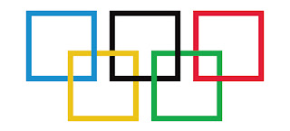
So, just for fun, let’s see what the Olympic logo looks like if it was made out of a square…

Another great logo includes the IBM logo. This logo uses rhythm to really make the logo dynamic. This sense of rhythm can be seen anytime you see a photo of a long picket fence or a grove of trees strewn along a roadway. Or a dashed line in the middle of a road that almost seems to continue into infinity. So, the broken separate shapes tied together with the successful use of proximity seems more interesting than simple lettering. Moreover, it carries the idea that the whole is made up of many little parts; this logo is in itself another great, sophisticated logo.
So you see, great logos (often) offer more of a story than what you ordinarily see by using simple typography. Spend time with your design and explore numerous concepts. Get your friends together, order pizza and ask them for their opinion! For more assistance on logo development send us an email at sales@trainingcastle.com – have a great day!


